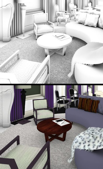
I've picked up some new rendering techniques, and I've chosen an old
W Hotel scene to refine my understanding of them.
Click on any of the images to enlarge.
step 1: lighting & shader adjustment
before & after lighting adjustment
The first thing I did was to calm the artificial light sources, which were overblown and over-saturated
(above left).
step 2: conversion to linear workflow
before & after gamma correction
I've recently begun to use a linear workflow, so I converted this scene, as well. For my purposes, linear workflow creates greater lighting distribution - which means the elimination of hot spots and dark corners - and better color accuracy, so the texture colors are less distorted.
step 3: multi-pass assembly
Render passes are used to create post effects, some of which would be time-prohibitive to render directly in the 3D program. They also allow precise adjustments of the separate lighting elements, after you've spent weeks rendering a sequence and don't have time to re-render. I'm still working on my compositing formula. What I've figured out, so far, is represented below.
diffuse pass
The foundation layer is the
diffuse pass: the objects' colors and textures, without any lighting effects.
occlusion pass, isolated (top) & multiplied w/ diffuse (bottom)
The ambient
occlusion pass adds a light falloff to corners and crevices. It's laid down next so it doesn't obscure the subsequent lighting passes.
global illumination pass
The
global illumination is any indirect light source, or light after it's bounced off a surface. (Its real world counterpart is known as diffuse interreflection.) I'm increasing the illumination of this layer by 10%. The comp is getting dark, but the next layers will bring back some light.
reflection pass
With the
reflection pass, everything begins to come alive.
caustics pass
Caustics create the sensation of light pouring out of light sources. The saturation of this layer was turned up (i.e., more colorful) 40%. A mask fades out over-bright areas like the floor lamp and ceiling.
refraction & self-illumination passes
The refraction pass is decreased slightly because I want to add glow later without it being blown out. I also masked off some of the candles' refraction to reduce their brightness.
I used
z-depth to add small amounts of depth-of-field and fog. They're exaggerated here to illustrate the effect.
glow, highlight, & added to mix
The glow layer
(left) was created by mixing and blurring most of the previous passes. The highlight
(center) was derived from the
specular pass.
bump normal pass, before and after processing
Finally, a
bump normal pass was added to send some warm light down to just the sofa, and make its tufting pop a little more.
all together (click to enlarge)
Above, is the complete composite. Below, is a comparison between old and new image details.
before (left) & after (right)
On the right side, you might notice greater detail and depth, a wider range of color, and more radiant light.


No comments:
Post a Comment